About the project
Fairfax Media’s Business Intelligence team asked me to come in and look at how they were presenting information visualisation to their business users. While uptake had been high on some of their analytics apps others were struggling. Feedback from end users were that the reports and dashboards were clunky and difficult to use. The key issue they were struggling with was taking a user centred design approach to analytics. This meant understanding what users needed through contextual enquiry rather than traditional requirements gathering.
Understanding the technical landscape
The first step of the process was understanding the technology being used. This included reasoning about the underlying data layer, data pipelines, and visualisation software.
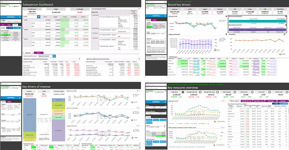
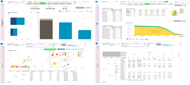
Dashboards were designed and built in Qlikview with some prototyping in Tableau. This required familiarisation with both tools. Ultimately all final designs were built directly in Qlikview using real data. This allowed a rapid progression from ideation to development.
Understanding print & digital publishing
To be able to design effective visualisations that could solve real business problems I had to develop an understanding of the business. This meant knowing how advertising is sold, booked, and delivered, as well as how the subscription model worked. This meant not just understanding the digital side of Fairfax media but also the print business as well as various “Digital Ventures”.
Once I understood the technology and the business I established a set of business goals an objectives. I was tasked with designing dashboards and reports for the following key areas:
- Print & Digital Advertising Sales
- Digital Yield
- Digital Audience & Web Traffic
- Print & Digital Subscriptions
The existing dashboards & reports
Evaluating the existing dashboards & reports revealed a well intentioned but technology driven end-result. Visualisations, dashboards, and apps were all centred around the underlying data not what the business needed to see. They also lacked design consistency and were plagued with usability issues. Some of these issues were driven by the limitations in Qlikview, others through a lack of understanding of User Centred Design.
User Research – Contextual Enquiry
Understanding the technology, the business, and the current design solutions was only the first step. The next objective was to understand how and why the visualisations were necessary, what questions they could answer, and what business decisions could be made using those answers. This was completed through a series of contextual enquiry activities:
- User Interviews
- User Observation
- Surveys
- Subject Matter Expert Workshops
- Collaborative design sessions with end users
Each of these methods was employed to understand what business users did day-to-day, how data helped them, and how more data could help them if appropriately presented. The previous approach was to ask users what they wanted – my approach was to ask users what they did and evaluate how we could help them.
Desk research: information visualisation
There exists a large amount of literature about information visualisation, including best practices and research driven methodology. Throughout my design process I went through various resources to understand these best practices and applied them to my designs.
This culminated in a 2hr training session I ran with the development & BA teams about how to do effective and usable information visualisation. A detailed version of the training presentation is available on Slideshare: Usable Information Visualisation.
Low fidelity sketching
Throughout the project low fidelity sketching was a vital component of the design process. It enabled rapid ideation as well as quick testing of ideas with subject matter experts and stakeholders.

Design in Qlikview, usability test, refine, productionise
The design process took place entirely in Qlikview. I built out each of the analytics apps using a subset of real data. The next step was to usability test with real users, check for the most pressing issues, gather feedback, then update the design. Because the designs were built with the same tools the developers used the ultimate development time was rapid.
The final design involved a UI standardisation, new design components to replace built in components of the app, and a user centred approach to visualisation.